Like almost everything in life, logos have a price, and their creative process often requires impressive work. Its value depends on many factors, such as the quality and reputation of the design studio/agency, the consulting and strategy requirements, the required corporate applications, as well as the impact and scope it will have, among many others. Throughout history there have been many logos that have attracted attention for different reasons, such as errors, appearance, meaning, origin or prices. In this article we will talk about the logos that have baffled the design world due to their exorbitant prices, which exceed limits that you will not be able to believe and will make you reconsider your rates, in case you are a designer.
The logo of the city of Belfast ($ 280,000)
Can you imagine what you could do with $ 280,000? Well, surely the team in charge of the logo of the city of Northern Ireland did. Designed in 2008, the logo can be interpreted in two ways, a “B” or a heart. The name of the city is written inside the logo, which you can find in different colors: lime, blue, fuchsia, maroon, gray and aqua. It is usually accompanied by one of the following slogans: “Be Welcome”, “Be part of it” and “Be vibrant”. The logo is intended to make the city more attractive to tourists and investors, welcoming them with open arms, highlighting the dynamic and vibrant nature of the city, and getting as far away from the city’s previous turbulent years as possible.
The logo of the city of Melbourne ($ 625,000)
Apparently spending a lot of money on a city brand was a custom in the past decade. This time it was the turn of the Australian city of Melbourne, which invested almost three times as much as the previous city in its logo. The logo was designed by Lander Associated in 2009, and its main objective is to provide a corporate look and value for the corporate city of Australia. The curious “M” has different shades of green and blue, colors related to confidence, seriousness and efficiency. The sharp edges of the “M” are an analogy, or pun, to city innovation, since “cutting edges” means sharp edges, but if it is simplified to “cutting edge”, it can also be interpreted as innovation.
The criticized 2012 London Olympics logo ($ 625,000)
The logo designed by Wolf Olins was revealed in 2007 and was harshly criticized by the London community, including the then Mayor of the city, due to its “pathetic design and that it did not represent in any way the culture or monuments of London”, comments such as “My five-year-old son would design something better” did not wait. Despite receiving such harsh criticism and being called unprofessional, Olins still received $ 625,000 for the design. The Olympic Games are always of great importance and investment is not spared, but we could say that this time they exaggerated a bit.
The Pepsi logo redesign ($ 1,000,000)
That’s right, we’ve hit the million mark and we’re not even halfway up our top yet. The price is perhaps a little justified due to the brand we are talking about, however, it is still incredibly high, especially if we consider that the logo is a slight alteration of the previous one. This new logo was rumored to be trying to match the timeless Coca-Cola logo designed in 2008.
The BBC’s oldest logo ($ 1,800,000)

The British Broadcast Corporation (BBC) is the UK’s largest communication company, and one of the largest in Europe and the world, so you need a logo that truly represents it. That is why they spared no expense when redesigning their 1997 logo. The logo is made up of three frames in which are the recognized acronym of the company “BBC”, the design has different variations in color depending on the platform. We could say that the logo was a good investment, since it has become one of the most recognized logos in recent years. In addition, the logo broke the record of being the longest lasting for the company, with 20 years. So good for the BBC.
The redesign of Australia and New Zealand banking Group (ANZ) ($ 15,000,000)

The joint venture ANZ, the largest bank in New Zealand and the third largest in Australia, ran a full rebranding campaign that lasted 2 years, starting in 2010 and ending in 2012, so the figure is not only for the logo but for all the new visual identity of the company. Despite the large number, the company does not regret the investment as they feel it was necessary and it had good results.
The innovative Posten Norgen logo ($ 55,000,000)

The logo stood out because it was quite different from the ones that were used to seeing in Norway. Posten Norgen is the Norwegian postal service, it belongs to the State, its headquarters are in Oslo and it basically owns the postal monopoly of Norway. “Posten” means “post” in the Nordic language. The new redesign was introduced nationwide in 2008, along with a rebranding campaign, when all previous logos were replaced by the new one. Fortunately, the millionaire expense was worth it as the new image was a success. It is believed that the logo stood out because it was quite different from those that were used to see in Norway.
The Accenture logo: multi-million dollar typeface ($ 100,000,000)
Third place is taken by Accenture, a Dublin-based multinational IT company, known for its outsourcing services, which opted for a fairly simple and expensive typeface for its logo. The expensive rebranding (absolutely from scratch) was designed for the company Andersen Consulting, after it separated from Andersen Accounting Group in 2001, so with all intentions not to be related to the old brand, it requested a full image reconstruction.
The failure of British Petroleum (BP) ($ 211,000,000)
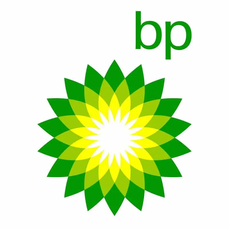
Apparently the British like to invest a lot in logo creation, only this case far surpasses that of the Olympic Games. After having the same logo for 70 years, the London-based oil and gas company, British Petroleum (now known simply as bp), decided to redesign its image in 2000, investing 211 million dollars. The logo has been used to mock the corporation in different occasions. The logo consists of a kind of green and yellow sunflower (the original colors of the company), which tries to evoke a constant flow of energy and a greater “green” awareness, the logo is also accompanied by the slogan “Beyond Petroleum”, as an allegory that the company decided to pay more attention to the environment in its processes. However, the brand’s attempts to appear more eco-friendly have been overshadowed by oil spills, which is why the logo has been used to mock the corporation on various occasions.
The most expensive logo in the world: Symantec ($ 1,280,000,000)
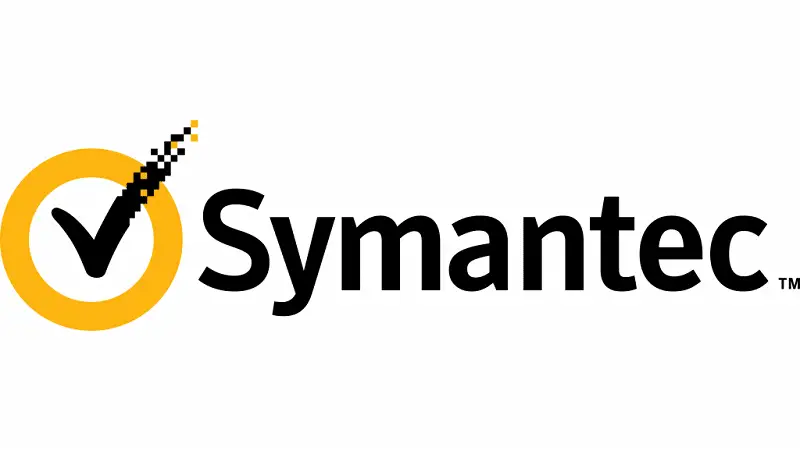
Founded in 1982, during its more than forty years of history, the corporation has had 4 different logos, always changing them at the beginning of each decade: 1990, 2000 and 2010. During its latest redesign, the corporation incorporated various elements of the logo from its latest acquisition, Verisign. In the new logo, the well-known Verisign “pixelated checkmark” was added, a sign with a large rights session because it is a standard of quality and security on a website, in other words it represents the authentication of security certificates (SSL) for websites, so it is crucial for people to trust pages related to commerce or other activities, and therefore it is quite valuable. This is the main explanation for the high price of the logo, it is important to note that the checkmark generates billions of transactions per year and everyone who wants it on their website must pay a commission. However, there are many who have described this redesign as a mistake and something unnecessary, especially since the corporation is going through difficult times. We hope that if Symantec redesigns its image again for the beginning of 2020, it will not exceed the overwhelming figure that its latest logo has imposed, because it would be simply insane.
